A User-Friendly Website for Athletes
I took a new website concept from design to launch in six months. To create an effective product, I needed to understand the motivations (and pains) runners felt - on the website.
PROJECT:
DESIGN TO LAUNCH: WEBSITE
ROLE:
UX DESIGNER
SKILLS:
SURVEY DESIGN, A/B TESTING, COMPARATIVE ANALYSIS, BRAND CREATION
TIMEFRAME:
AUGUST 2021 - OCTOBER 2024
PROJECT OVERVIEW
The mission of the Athens Road Runners is “to inspire and engage individuals to achieve health, fitness, and training goals through the sport of running.” While the original website was used to share information on community runs, the redesign allowed us to ask:
How can a website inspire someone to join a run club?
Using member surveys and market research, I redesigned the Athens Road Runners website and newsletter to give users a more tailored experience. The result was a year-over-year increase in membership enrollment and monthly growth in online engagement.
RESEARCH METHODS
My first step in the redesign process was to research aspirational track clubs. I chose various geographic areas with a broad range of populations to understand how community-running groups serve their specific locations. From the research, several themes made a website stand out:
Use of unique branding
A clear statement of group purpose
Recent images and information
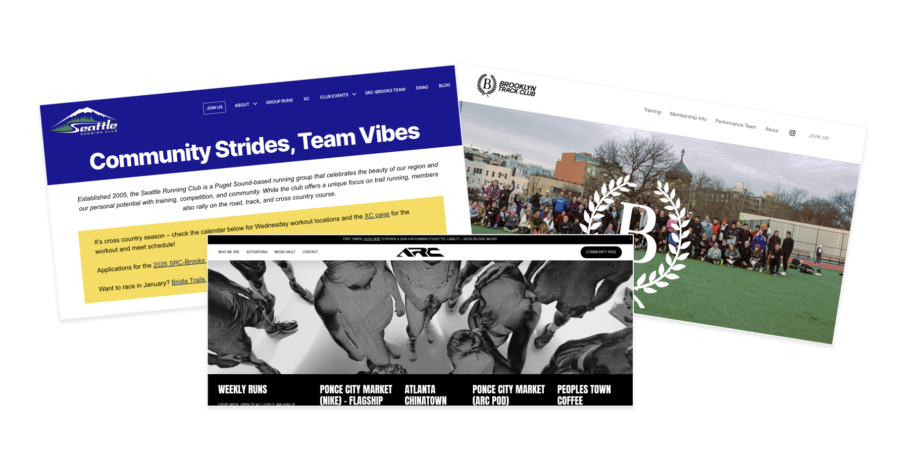
Screenshots of several of the run clubs that influenced the rebrand.
PROBLEM SPACE
ONE SITE, TWO AUDIENCES
From user surveys, it was clear that two different audiences used the ARR website. Active members used the site to find information on yearly events and check the group run schedule. These users didn’t need to stay long on the site and could also ask other runners for supplemental information. A different audience, new users, experienced our website differently. These users had to learn several critical pieces of information quickly - like membership fees, weekly run rotations, and who to contact.
DESIGN SYSTEM
The original Athens Road Runners brand was established around 2011 and consisted of red, yellow, and white. Many aspects of the original branding were tied to a logo that was not widely used. With a new website in the works, rebuilding some of the brand from a design and usability standpoint made sense.
I designed a brief brand guide, attached below, to expand the colors of the website. The guidelines helped to ground the development of the website and other digital tools - like a Discord.
RESULTS
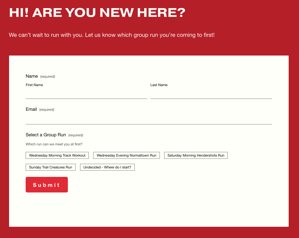
USERS WANT TO MAKE A DIGITAL INTRODUCTION
A frequent pain-point for new members and visiting athletes was that they don’t know anyone in the club and it’s difficult to make introductions - especially when they don’t know if someone will run their pace.
I created a “New Athlete” page and made the primary action an introductory form that allows users to indicate what run they will attend. It motivates them to commit to a run and we can ensure a current member knows to look out for them.